
Pic. 1. Human Interface Guidelines, Apple, 1992
Pic. 2. macOS Tahoe, Apple, 2025
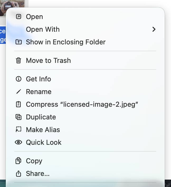
macOS Tahoe menu with icon next to each menu item
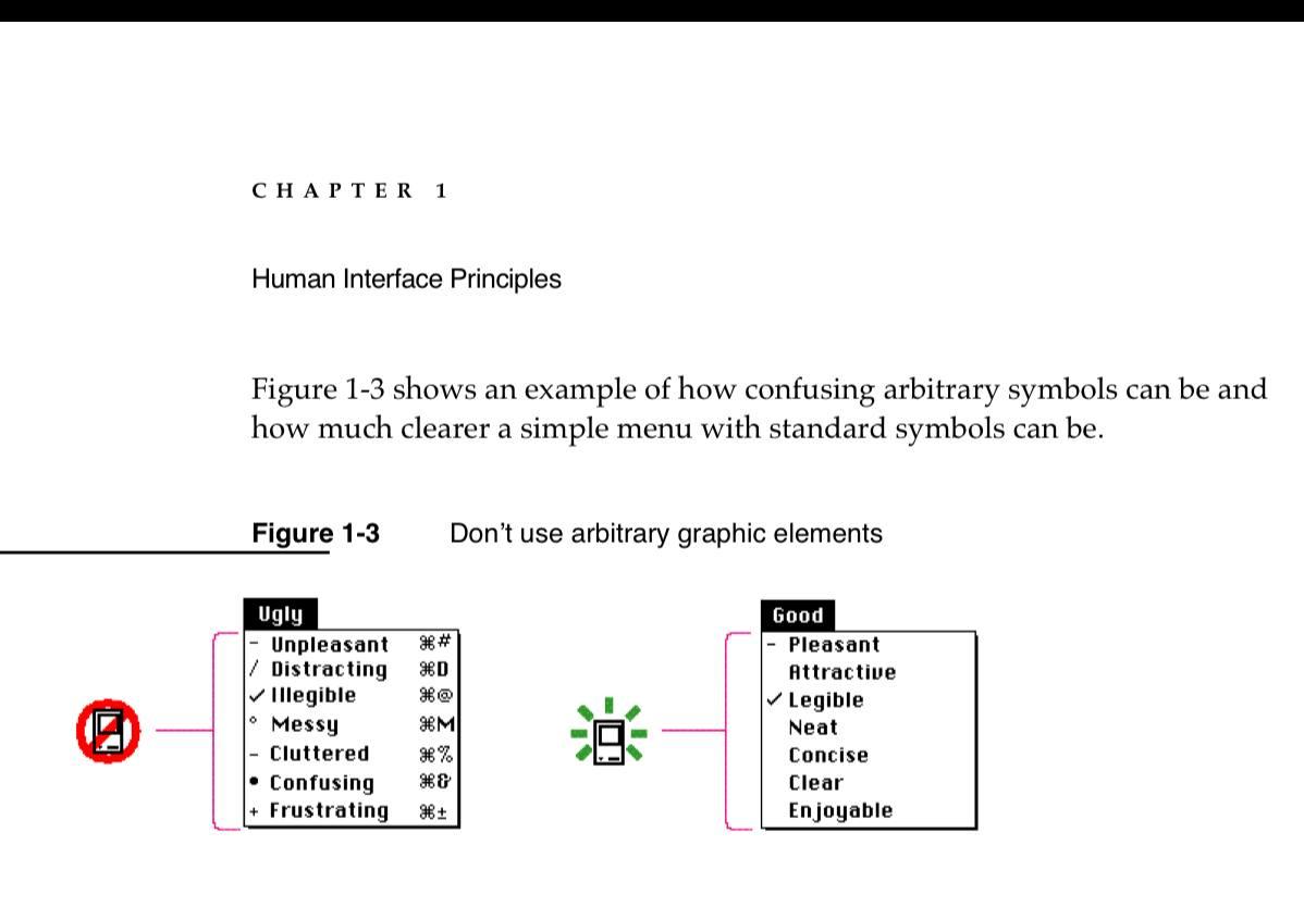
A quote from HIG: two menus, one with icon next to each item labeled “Ugly” and one “Good” with just two simple icons for 7 items
19


