The second set of examples pretty much have to be in colour, OTOH, as the colours do a lot of heavy lifting in conveying the story #montreal #photos #photography 3/6
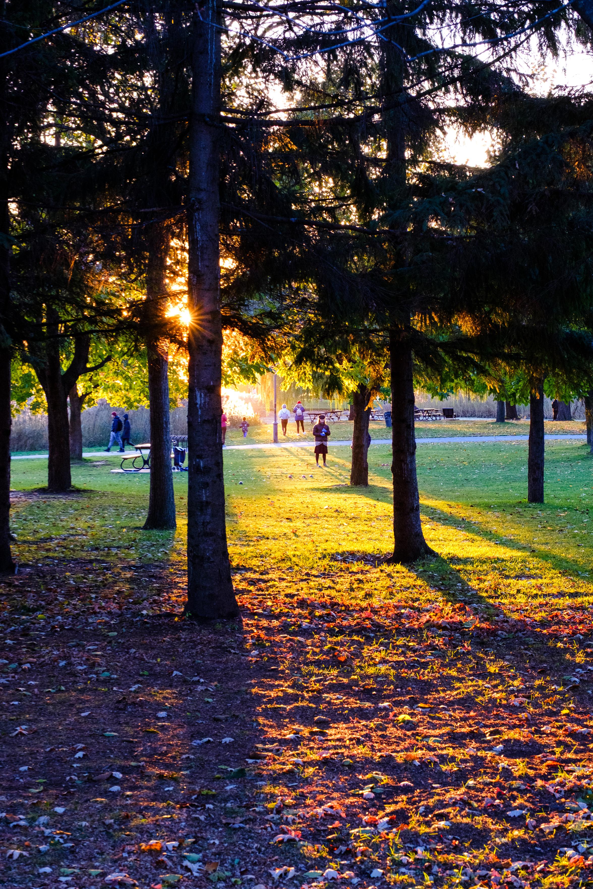
The autumn colours in the park look neatly divided into three groups. A woman stands in the distance between the trees
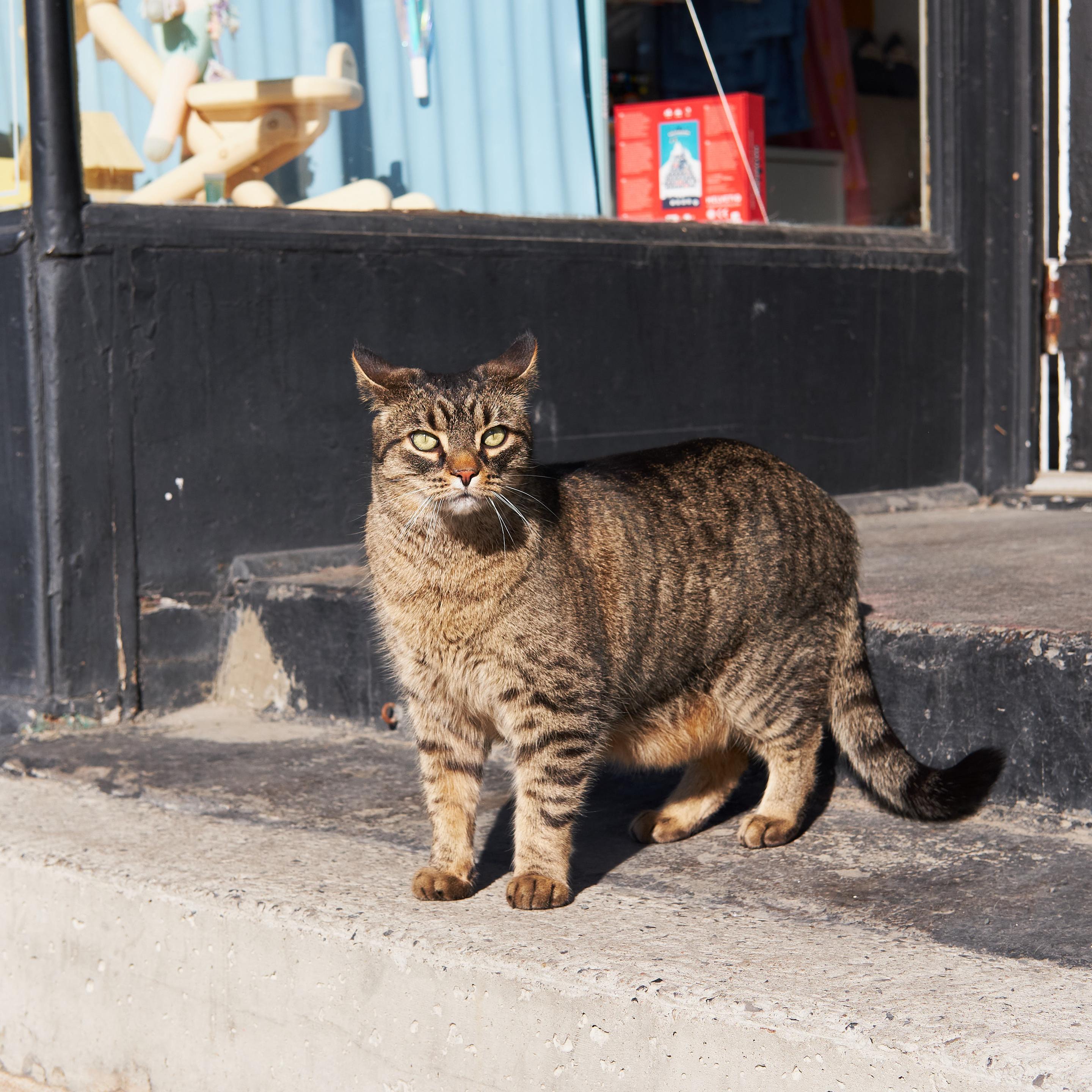
A very chonky cat stands outside a store in Montréal
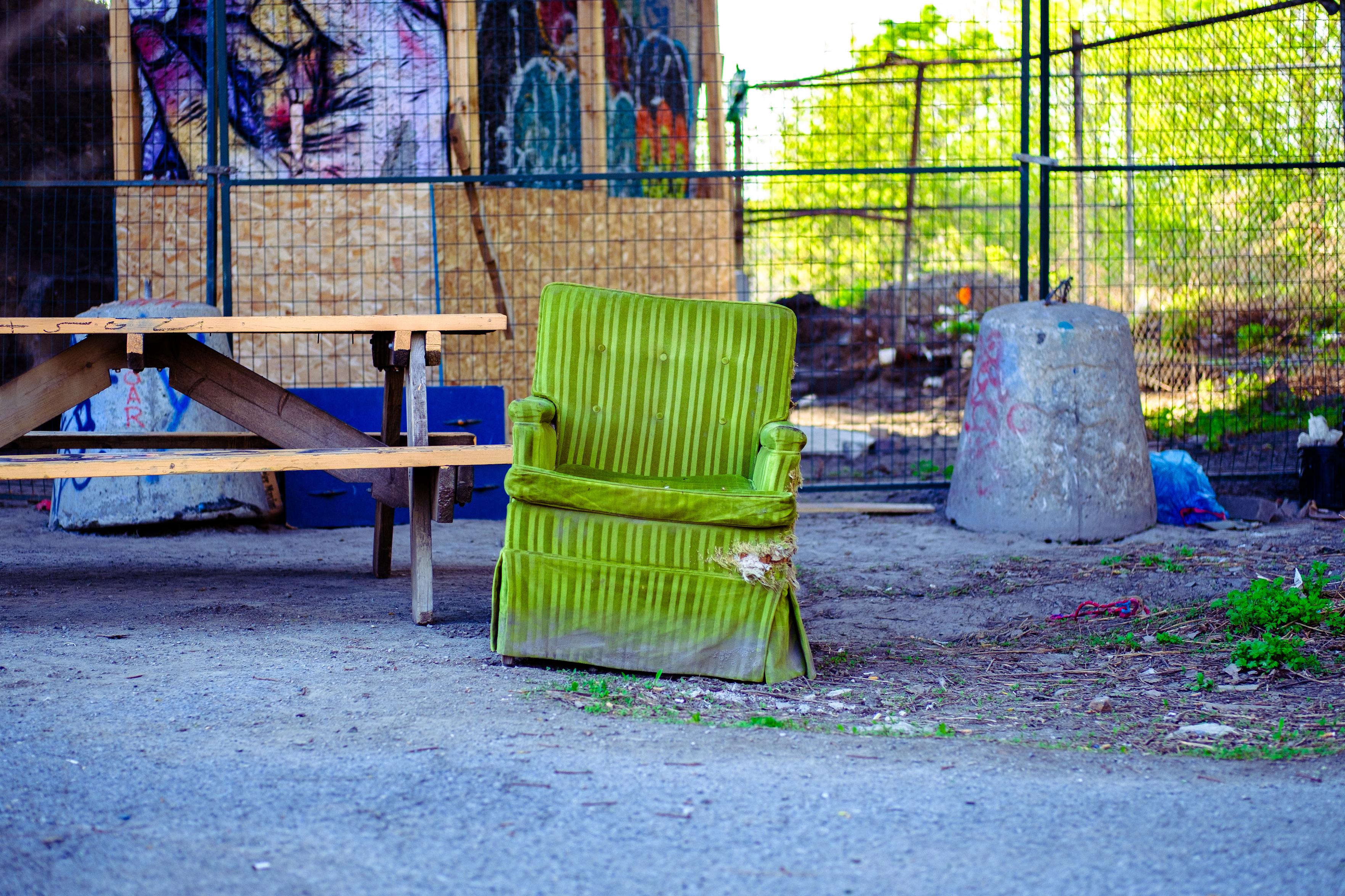
A green chair has been left to rot under a bridge in Montréal
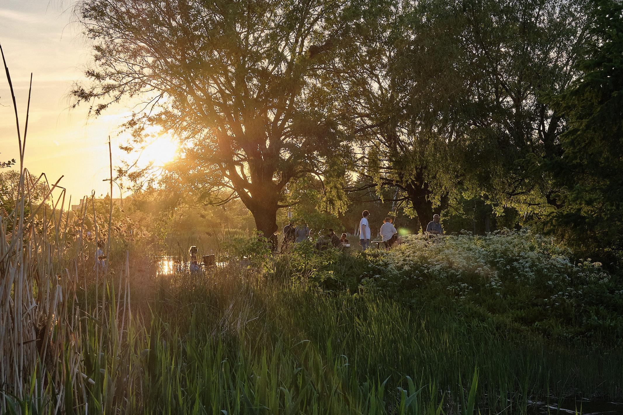
The sun sets behind a birthday party in Parc Jarry. People are having fun among the trees
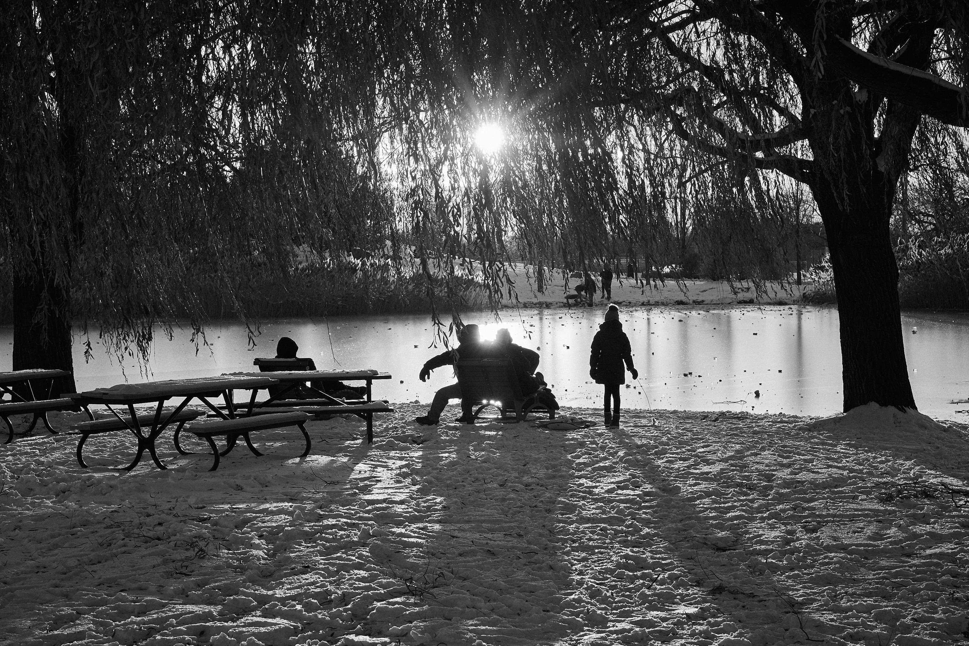
1